We are now in the eighth year of the NBA and Nike unveiling their annual “City Edition” uniforms, and this year’s batch left much to be desired.
The first few seasons delivered instant classics such as the “Miami Vice” series, Utah’s sunset uniforms and Chicago’s jerseys that were modeled after the city flag. Yet, Nike’s mandate to keep jersey sales flowing and pump out 30 new uniforms a year has led to the last few seasons being lackluster. The truth is, there are only so many different ways that you can design an alternate uniform around a city before you run out of ideas.
Nonetheless, there are still some good uniforms in the bunch and I’m sure several will grow on me throughout the season. These rankings are not determined based on any quantitative value, but rather a few factors such as the aesthetic, the color scheme, how well I think it would look in a live game and whether I personally would wear the jersey.
The 2024-25 batch leaked roughly a month ago, but I wanted to wait until I could see each uniform with numbers on them, which I believe greatly improved some of the jerseys. Without further ado:
Note: Due to the large size of the images, some of this article may be cut off if you’re reading it via your email. In order to ensure you can see all 30 teams, please either click “View in browser” at the top of your page or “View entire message” at the bottom of your page.
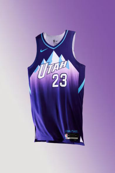
1. Utah Jazz
I’m a big fan of every Jazz jersey that includes its beautiful mountain ranges. Combine that with a cool-toned color scheme that reflects the late 90s Utah teams and you have the best City jersey of the bunch. I’m excited for 2025, when this style becomes Utah’s permanent home uniform.
2. Phoenix Suns
This uniform is supposed to mimic the 1995 All-Star jerseys and looks great in doing so. Phoenix has used “The Valley” name in its City jerseys since 2020, and while the Suns no longer have the pixelated Arizona sunset on the front, I like this year’s Wild West theme.
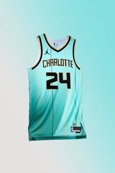
3. Charlotte Hornets
While writing this, I realized that these are the exact same jerseys that the Hornets repped in the 2020-21 season, except the wordmark reads Charlotte instead of “Buzz City.” However, I liked those uniforms a lot and I think the mint green contrasts well with cream and black lettering and numbers. If it ain’t broken, don’t fix it.
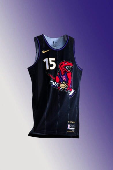
4. Toronto Raptors
The jersey itself is actually just fine, but the dunking dinosaur that honors Vince Carter gives it a big boost in the rankings. This is the first time in the eight-year history of City Edition jerseys that Toronto’s uniform isn’t inspired by Drake’s OVO brand with a black and gold colorway, and along with their new throwbacks that debuted earlier this season, I’m glad the Raptors are celebrating their past.
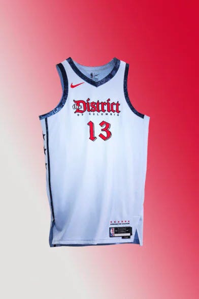
5. Washington Wizards
Last year, the Wizards unveiled a uniform inspired by the boundary stones in Washington D.C., and while the idea was creative, the design was incredibly ugly. The creators did a much better job this year, incorporating the gothic text into Washington’s red, white and blue color scheme. I love the trim as well.
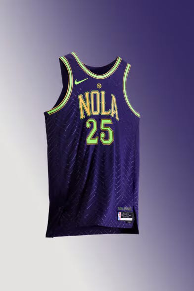
6. New Orleans Pelicans
I love that New Orleans went with a Mardi Gras theme and I actually moved this jersey up in the rankings while writing this blurb. The bone pattern is really unique and ties into the city. Bonus points for creativity, even if I probably wouldn’t have this uniform in my closet.
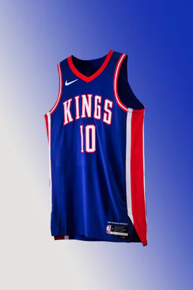
7. Sacramento Kings
These are a modern take on the Cincinnati Royals uniforms, which existed from 1957-1972. While not super flashy, these jerseys are clean, which keep it above the next tier. This is probably where I would draw the line between the “good” jerseys and the “average” or worse.
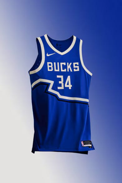
8. Milwaukee Bucks
Milwaukee has blue alternates for the fourth time in five years, which is supposed to represent Lake Michigan and the city’s three rivers. The color is nice, but the uniform overall is a little bland. The line across the jersey is supposed to be Wisconsin’s outline, but it just isn’t doing much for me.
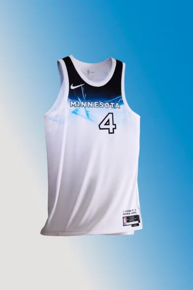
9. Minnesota Timberwolves
This jersey is cool, but it’s pretty much the reverse of last year’s, which blended water at the bottom into white at the top. That design felt more creative, though, while this seems lazy.
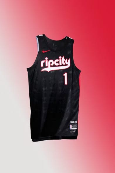
10. Portland Trail Blazers
The Blazers also copied last year’s jersey, essentially just flipping the text color from red with a white outline to white with a red outline. It’s simple but neat, although I’m docking points for lack of creativity.
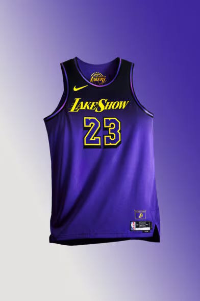
11. Los Angeles Lakers
I disliked the gradient when this was initially leaked, but the numbers really pop on the background and I think seeing players wear them made it grow on me. It’s definitely better than last year’s “California Dream” uni.
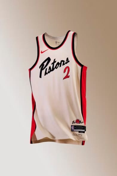
12. Detroit Pistons
Detroit has delved into the “Motor City” nickname many times with its alternates, and this jersey feels immediately derived from the Harley-Davidson logo. Bravo for trying an entirely new color scheme and making cream and orange work together.
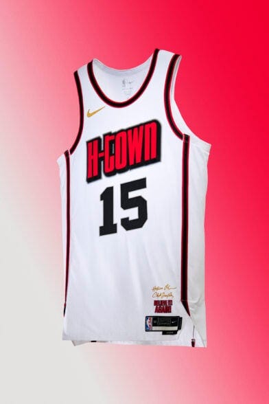
13. Houston Rockets
Houston has the benefit of being “Space City,” yet hasn’t done anything with that nickname on its City Edition uniform. The wordmark is fine, but overall, this design doesn’t strike me as anything special.
14. Philadelphia 76ers
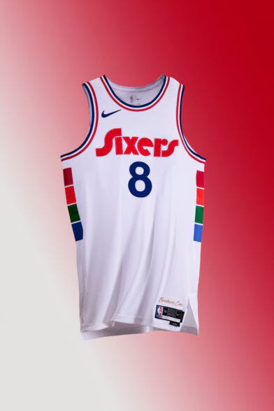
The Sixers essentially reversed its 2021-22 City Edition design, which is supposed to resemble a throwback while honoring the team’s old arena, but it also reminds me of a stop light.
15. Oklahoma City Thunder
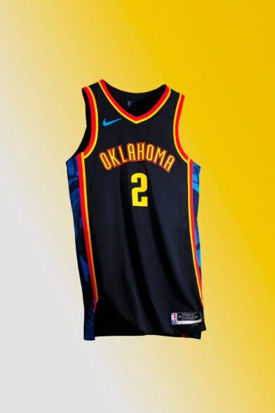
The Thunder don’t have a ton of history to go off of, so that limits the options as far as City Edition jerseys go. I really just don’t think the yellow and orange look that good together on the black background, and I honestly don’t know how I’d fix this.
16. Cleveland Cavaliers
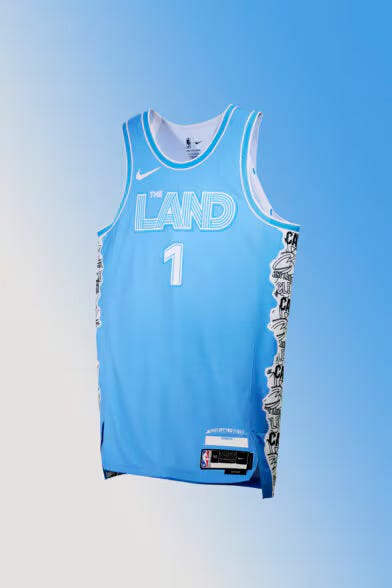
I love baby blue uniforms, but the white text is a little hard to see. The past Cleveland logos and wordmarks on the sides in black and white are pretty cool.
17. Golden State Warriors
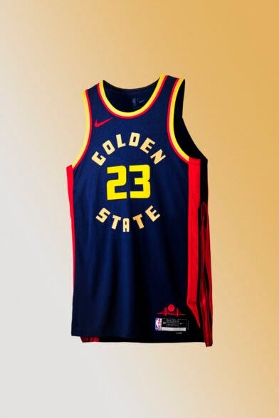
The uniform is supposed to be modeled after the Golden Gate Bridge, but I don’t really see it. Why are the numbers a different yellow than the words?
18. Los Angeles Clippers
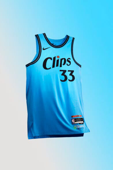
This feels like owner Steve Ballmer wanted a baby blue jersey and didn’t really care what else went on it.
19. New York Knicks
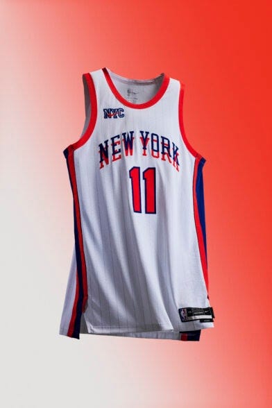
Evidently, it’s pretty hard to make good-looking alternate jerseys with a blue and orange color scheme — the Knicks haven’t had decent City uniforms once in the eight years. I feel like I should be wearing 3-D glasses, just like 2023.
20. Indiana Pacers
Another reverse of last year, I’m just not sure I rock with bubble letters as the main font on a uniform. The splattered paint on the side is fun and better than a gradient.
21. San Antonio Spurs
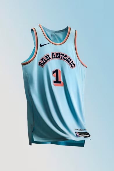
The Spurs had almost the exact same uniforms last year, but the base was white instead of this weird blueish grey. I liked those a lot better.
22. Brooklyn Nets
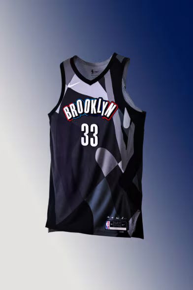
I admire the Nets’ commitment to allowing local artists to design their City Edition uniforms in six of the last seven years. This would be a neat design for wall art, just not something I’d wear.
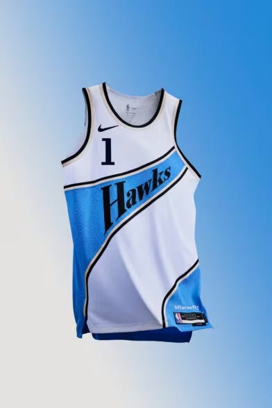
23. Atlanta Hawks
I like how the wordmark goes up and to the right as if it’s a Hawk soaring away, but overall the design is just fine. I could’ve designed this in 2K. Bring back the peach-colored accents!
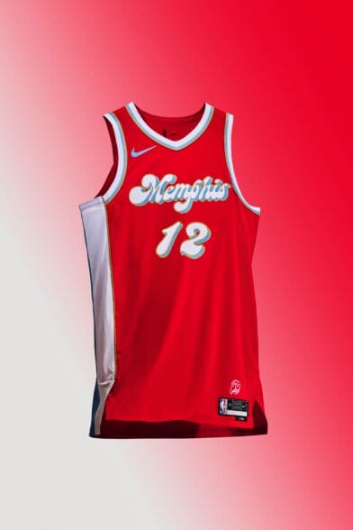
24. Memphis Grizzlies
I get the appeal of this, I really do. I understand that it’s a throwback to the ABA’s Memphis Sounds of the 1960s and 70s. It just hurts my eyes a bit, and it reminds me too much of Crest Toothpaste.
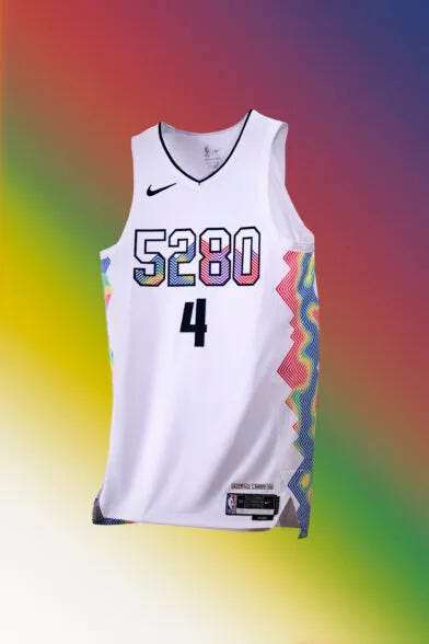
25. Denver Nuggets
Enough with the 5280 branding. There should not be five, or even six, similarly sized numbers on a sports uniform. The topography map of Denver on the side is really creative, but there are too many numbers.
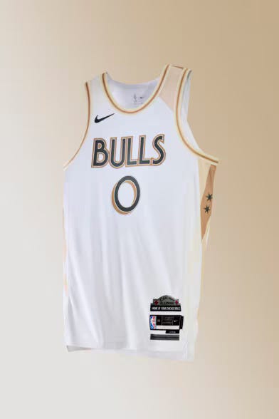
26. Chicago Bulls
The Bulls have so many cool colors to use between their usual colorway and baby blue that they utilized in Chicago flag-style alternates in the late 2010s. Yet, they settled on minimal grey and gold?
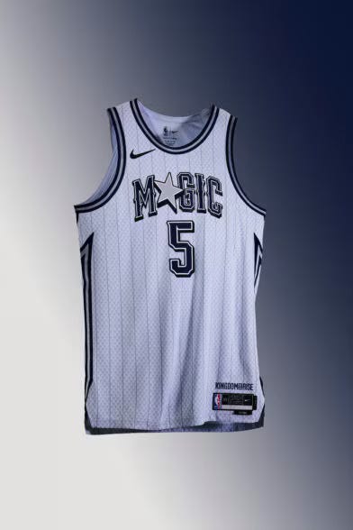
27. Orlando Magic
Another team with great colors that decided not to use them. This is a boring Magic jersey, with the only cool element being the star replacing the “A.”
28. Miami Heat
Oh, how the mighty have fallen. We were blessed with five years of beautiful “Miami Vice” jerseys before two years of wearing ransom notes, and now the Heat have some of the worst alternates in the league with the corny “Heat Culture” phrase across the chest. If it ain’t broken… you know the saying.
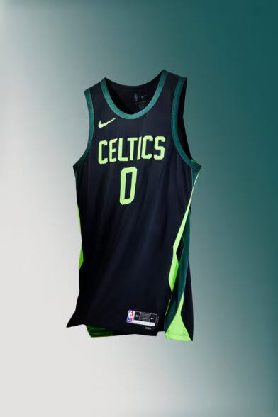
29. Boston Celtics
Hello, 2017 Michigan State? I’d like to report a crime. These are not fit for the NBA Champions. This feels straight out of a middle school boy’s closet.
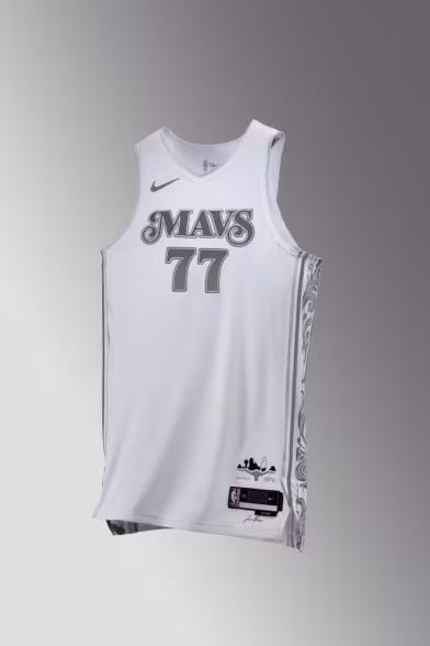
30. Dallas Mavericks
I am tired of teams trying to make grey-on-white and white-on-white jerseys work. The coloring here is so bland that not even the design on the side can save it. This is supposed to pay homage to Dallas as the birthplace of American Blues music, but nothing about this uniform says that.
Bonus Note: I think the reason so many teams have tried to make light colored text and numbers on white jerseys work is because of the success of the White Hot Heat uniforms from the early 2010s. Those worked because of the contrast between the black outline and the white numbers, and it made sense because of how it actually tied into the name. The Thunder tried light outlines on white/grey jerseys a few years ago and they were bad. The Magic, Bulls and Mavericks all attempted a similar thing this year and ended up with boring uniforms. It’s time to put it to rest.





Justice for San Antonio 😞😞
So much better than the collection of MLB city connect jerseys